Unifying the food and consumer goods landscapes
We're connecting manufacturers and distributors to retailers and end consumers
We deliver integrated digital solutions and data-driven insights across the entire value chain enabling businesses to make informed decisions and drive profitable growth.
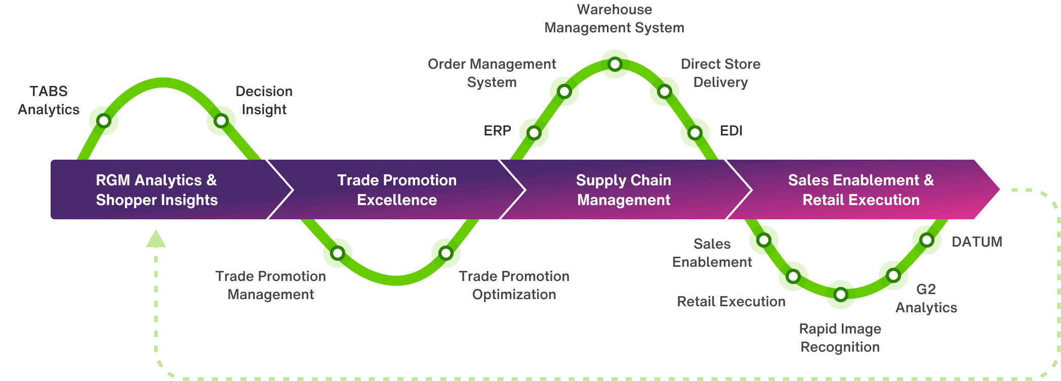
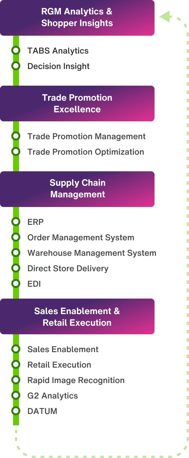
Our food, beverage and consumer goods ecosystem
Our food, beverage and consumer goods ecosystem
Consumer goods manufacturers

Streamline your planning, execution and analysis
Improve and execute your assortment, pricing, promotion and trade management strategies. Whether you’re in the retail or foodservice industry, TELUS Consumer Goods has integrated solutions that can help provide visibility and support across your entire sales journey, helping you plan smarter, execute more efficiently, drive revenue and increase your margins.
Learn moreSolutions
Sales agencies and brokers

Support your teams to achieve stronger sales
Give your teams the tools, information and capabilities to help them increase revenue and profitability. TELUS Consumer Goods has solutions that help you streamline your trade promotion management, customize price and commission structures, and execute your strategy to sell more product at better margins.
Learn moreSolutions
Distributors and wholesalers

Streamline distribution from purchasing to delivery
Every piece of your distribution process should work together. Get the tools to keep your supply chain running smoothly. Reduce errors, improve delivery times and increase efficiency to lower costs, grow your margins and build better relationships with your partners.
Learn moreSolutions
Food processors
Keep your focus on safety, speed and quality
Strengthen your brand reputation and improve production efficiency with enhanced supply chain visibility and quality analysis. TELUS Consumer Goods has solutions that help set and meet high product quality and compliance standards, and verify they’re being met across your supply chain.
Learn moreSolutions
Grocers, retailers and foodservice operators

Ensure safety, sustainability and quality
Build a reputation as a company that puts customers first when it comes to quality, sustainability and care. Save time and focus on delivering the best product possible with contract management software, a centralized and accessible database and tools to measure product safety and performance.
Learn moreSolutions
End-to-end sales journey
Our unmatched product portfolio supports the entire CPG sales journey, end-to-end, for retail and food service. Find out how our solutions can help your company.
Contact us to learn more